Thursday, December 9, 2010
Conceptual 3D Piece
Walking On Pins and Needles, a commonly used saying is represented visually here in this 3-dimensional sculpture using found objects. Created in 3D Design I at SUNY College at Buffalo State.
Book Cover Re-Design Project
This is the layout for a book cover for the classic To Kill A Mockingbird. I did this for a project for Visual Communication I.
Magazine Re-Design Project: Cover
This is the cover of the Food Network Magazine that i redesigned for Computer Graphics II. Reducing the amount of callouts on the front cover, i was able to simplify the whole look of the publication and draw the eye because it is different than other modern day magazines.
Below, please see the redesign of the center spread and a full type spread design that i have redone for the class assignment as well.
Centerfold Spread:
Below, please see the redesign of the center spread and a full type spread design that i have redone for the class assignment as well.
Centerfold Spread:
Next page type spread:
Realistic Wine Bottle
I created this wine bottle from scratch using a combination of Adobe Photoshop and Adobe Illustrator. Using the Revolve 3D tool and darkening and lightening aspects of the bottle, i was able to bring this illustration to life. A challenging project done in Computer Graphics II.
Printed version: 8.5" x 11" on Epson Matte Photo Paper
Printed version: 8.5" x 11" on Epson Matte Photo Paper
Wednesday, December 8, 2010
Time Period Poster
This was a project done for typography class. It is a piece reflecting a particular period in design history and must be an advertisement for the Buffalo Philharmonic Orchestra and a performance at Kleinhans Music Hall in Downtown Buffalo. This particular piece is representative of the late Constructivism Period in Design.
The Final dimensions of this poster are 11" x 17" printed on Canon Matte Photo Paper
The Final dimensions of this poster are 11" x 17" printed on Canon Matte Photo Paper
Wednesday, December 1, 2010
Abstract Wire Sculpture
I created this piece for my Intro to 3D class last year. It was originally meant to be hung and suspended from a ceiling but can also be presented laying on its side in this fashion. Aluminum 16g wire and Steel 24g wire were used in the production of this piece.
Flyer for "Buffalo State Free Thinkers"
This is a flyer i created for the first general interest meeting for an organization on my campus called Buffalo State Free Thinkers. It measures 8.5" by 11" and in greyscale for xerox reproduction.
Third of the Absolut Ad Series
This is the other Absolut Vodka Ad that I turned in for my Computer Graphics II class. It was printed out on 8.5" by 11" on semi-glossy photo paper.
Second of the Absolut Ad Series
This is one of the two Absolut Vodka Ads that i handed in to my Computer Graphics II. It measures 8.5" by 11" and it was printed on semi-gloss photo paper.
Monday, October 25, 2010
First of the Absolut Ad Series
This is the first Absolut Vodka advertisement that i completed for my Computer Graphics II class. They are really quick little jobs but play interesting tricks on the eye. There will be many more of these as ideas pop into my head. Influenced by the original Absolut Vodka ads.
Dimensions: 5" by 7" 72 dpi, Computer/Web Quality Only
Monday, October 18, 2010
Senior Table
I created this table senior year of high school from scratch. I bought the wood and found the glass laying in my basement. The table was auctioned off to raise money for the art program at my high school. It came equipped with seven coasters that easily store away in the side of the pyramid, adding an extra sculptural element to the piece. I was heavily influenced by Mayan imagery and used wood burning in order to etch the Mayan-style designs into the table.
Cover of High School Sketchbook
This is the cover of my sketchbook that i had throughout high school. I drew the strange composition on masking tape.
FInal Dimensions: About 9" by 12"
Bike Rendering
This is an image of a pencil rendering i did of a bicycle senior year of high school in late 2008. It was done as a project for my portfolio prep class. I feel as though the lighting of this photograph enhances the overall feeling of the pencil rendering and gives the piece more feeling.
Final Dimensions: 24" by 36"
Friday, October 15, 2010
Inspired by A Day To Remember
Just a little something that i did when i was heartbroken, the lyrics of a song in front of an eye that appears to be longing for something more, something special.
Final Dimensions 17" by 22"
Wednesday, October 13, 2010
"In Ecstasy"
Scanning sketches and images that i have collected, i put them together to create this final composition using Adobe Illustrator and Adobe Photoshop CS4.
Final Dimensions: 17" by 22" on semi-glossy Canon Photo Paper
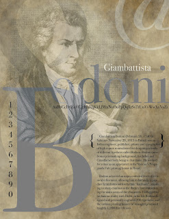
Type Presentation Page: Giambattista Bodoni
This is a project from the Typography class i am currently taking at Buffalo State College. It includes an image of Giambattista Bodoni, the original designer of the Bodoni typeface. This composition also includes the entire alphabet (uppercase and lowercase) in Bodoni type, numerals 1-0, and five symbols that are in the Bodoni typeface.
The final piece is 8.5" by 11" at 300dpi
"The letters don't get their true delight, when done in haste & discomfort, nor merely done with diligence & pain, but first when they are created with love and passion." - Giambattista Bodoni
Subscribe to:
Comments (Atom)


